Exploring Urban Change Through Population Density
- Aaron Licker
- Mar 8, 2018
- 6 min read
So, after an epic break from blogging, Licker Geospatial Consulting is back at it, with a nice new post on our favorite topic, Urban Change!
Part of this has been spurred on by our recent collaboration with the fine folks at Renewable Cities. With them, we've been looking at changes in population dynamics over time in Metro Vancouver, British Columbia and other Major Canadian Municipalities. This post will show off something similar but will be more related to how we can possibly understand multi-temporal, multi-variate changes through some nifty mapping.
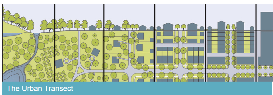
Now as many of our past and current collaborators know, Licker Geospatial Consulting cut their teeth in urban planning and then did a right angle turn into environmental planning and earth sciences (and then some sort of squiggle into geospatial consulting!). One of the coolest things about the earth sciences (i.e. geotech) is the use of cross sections to comprehend and visualize multi-dimensional data. Now because urban planners need to fancy things up all the time, they took the humble cross section and renamed it: The Transect (Thanks DPZ) The transect is, of course, totally awesome and very useful to help planners systemize urban environments. Very rarely, however, do we see the transect used as a tool for urban analysis and information synthesis. Even more rarely do we see transects used to understand temporal change. What we want to achieve with this post is to show how a transect, or cross section can be employed to understand urban spatial-temporal change and possibly the influence of mass transit on urban development.
LET'S TALK DATA
(Non GIS nerds please skip to the next heading) As mentioned, through my collaboration with Renewable Cities, I've been amalgamating an awesome longitudinal set of census data (specifically population) for all of Canada. These data are great because they represent a controlled and assured set of measured data that is mostly comparable across multiple years. For this little post, I've focused my efforts on the lower mainland, but there is nothing stopping us from seeing how things have changed in any part of urban Canada, really. What we are using for inputs are Census Enumeration Points, Census Dissemination Areas, or Census Dissemination Blocks, depending on the year. Comparing these data is not as easy as just overlaying all these polygons into a massive set of longitudinal greatness, indeed what's really annoying (but inevitable) is that all of these blocks or areas are not the same size, shape or even types due to the fact they were created to administer Census data not to allow for cutting edge analysis, alas...

Transforming these data into information that we can actually use requires some generalization and interpolation. The quickest and easiest technique out there is to use a kernel density function on the centrepoints of each dataset so at least everything is on the same scale and in area density (which is what we wanted anyway). In plainer English, we made everything into density surfaces. Once I had these generated, we got even more clever and interpolated between years to generate this mesmerizing beauty below (but that's another blog post)....

WHERE'S THE ANALYSIS ALREADY?
So we got the density by year and you'll note we found some Skytrain lines somewhere. It's time to run some sections! Cross sections are pretty cool because they allow us to view overlaid data along a common axis, which greatly enhances our ability to synthesize data at a glance (In English again: lots of data quickly). What we did was: first, measure the change in population density between 2016 and 1976 (40 years of change: superb!) to develop an overall understanding of change, and second we used some GIS wizardry (go to the very end of this post for the method) to develop sections by Skytrain line. The results, with a little bit of interpretation are displayed below for your amusement and edification (click to expand all figures).

Let's walk through this slowly. First the rainbow of colours on the top figure represent change in population density, as expressed by the average number of people per hectare within an 800m neighborhood. Areas that are red are where the population has actually declined in the past 40 years and areas in brown are where it has increased (sometimes a lot!). The bottom graph shows the population density along the line starting at Waterfront Station to the left and ending at King George Station to the right. Each line represents the population density at that particular year. The Expo line was more or less completely built out by 1995, but change along the route has varied tremendously by station location. First note that between 1976 and 1986 there was almost no growth along the line! (astounding in this day in age!) However, post expo things started to change mostly around Joyce Station and New Westminster. After 1996 there was a ton of development around the Edmonds and Joyce Skytrain stops as well as in Downtown Vancouver (certainly related to de-industrialization and the Skytrain). After that development boomlet, you'll notice that the next big changes were both in Downtown Vancouver and in Surrey which saw the most growth in the 2006-2016 period. There are some other cool things to note: population density has not materially changed much at Nanaimo station, 29th Avenue, 22nd Avenue, and Scott Road (I would love to look at changes to employment though!).

It's a different story for density along the M line (and the sneaky extension I added in there) than the E line, that is for certain. First, you'll note that residential density increased very little in the City of Vancouver in the past 40 years along this line (likely because most of the existing M line route is still surrounded by active Industrial Land, for the most part, as well as by low density residential lands and the new M Line extension had not been built yet). However, Burnaby is a different (and interesting story). First, Skytrain induced development caused population density at both Gilmore, Brentwood, and Holdom to increase from effectively 0 people per hectare in 1996 to about 75 persons per hectare in 10 years! There's been a similar rate of change in Central Coquitlam as well. Another interesting density spurt is at Loughheed Town Centre which had a huge boom between 1976 and 1986 that didn't happen anywhere else along the line (this was basically due to an attempt at highway oriented multi-family development!). Finally, it looks like Moody Centre and Coquitlam Centre are due for booms given the recent Evergreen line extensions.

So, a drawback from similar scales between these three figures means that population density at the Yaletown Station is literally off the chart! To properly understand this change just note that in 20 years, the population density at Yaletown Roundhouse has increased from 100 persons per hectare to 245! (and was 0 in 1986!!!) Nothing else in the lower mainland even comes close. Take, for instance, the stretch between King Edward and 41st Avenue, basically zero change in 40 years. Richmond has seen some pretty big changes in the past 20 years but an order of magnitude less than Vancouver (likely flight path/flood plain induced). Now, more than any other graph we've looked at in this little assessment, this one will change the most in the next 5-10 years as there are big changes underfoot in the Cambie Corridor area, so stay tuned for a follow up blog post in 2022 ;) .
SOME SORT OF CONCLUSION
As with all of our posts here, we are trying to highlight an application of geospatial analysis that can help us make better urban planning decisions and understand our urban environments. The next time someone questions the transformative impact of mass transit coupled with de-industrialization then all you need to do is show them these graphs and explain what a cross-section is. (if only it were that easy). That being said, all this work is exploratory in nature, but super fun to do, so if you feel the need to conduct some longitudinal urban analysis then feel free to drop a line to aaron@lgeo.co. If you want to pick this post or our methods apart, the comment section is below!
FINALLY, NERDY METHOD FOR MAKING THE GRAPHS.
Simply put the method is to: first interpolate the vertices of a line against a surface and then plot those those interpolated values as y values on an xy graph where x values are measured and scaled against the length of the line!


Comments